Table of Contents

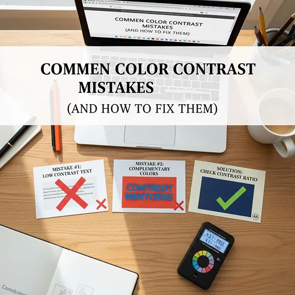
Navigating color contrast for web accessibility can feel complex, but addressing common mistakes is a straightforward way to make your content accessible to users with low vision, color blindness, and other visual impairments.
The Web Content Accessibility Guidelines (WCAG) set the standard for contrast ratios, which is the measure of the difference in luminance between two adjacent colors. Our goal is to meet the minimum Level AA requirements.
Here are the most common color contrast mistakes and how to fix them, using a contrast checker tool to guide your choices.
Common Color Contrast Mistakes (and How to Fix Them)
Mistake 1: Insufficient Contrast on Body Text
This is the most frequent and critical accessibility error. Using a light gray on a white background, or a dark color on a similar-toned background, makes text hard to read for everyone, especially those with low vision.
- Example of a Fail: Light gray text
#888888on a white background#FFFFFFhas a ratio of 3.2:1, which fails the 4.5:1 requirement for normal text. - The Fix:
- Use a color contrast checker to enter your text and background hex codes.
- Adjust the lightness or darkness of your text color until the tool confirms it meets or exceeds the 4.5:1 ratio for normal text.
- A simple fix is to darken the text to a color like
#767676on white, which achieves the necessary 4.5:1 ratio.
Mistake 2: Forgetting Non-Text Elements
Color contrast isn’t just for body text. Interactive elements and essential graphics must also have enough contrast so users can perceive and operate them.
- Example of a Fail: A light gray input field border on a white background. Or, a navigation arrow icon that blends into a light-colored banner.
- The Fix:
- Ensure all functional elements have a 3:1 contrast ratio against the color they are directly next to.
- For a low-contrast form field, either darken the border color or add a slight drop shadow to give it more visual distinction from the background.
Mistake 3: Relying on Color Alone to Convey Meaning
Color-coding is a helpful visual cue, but relying only on color to communicate important information (like errors, status, or links) is a major barrier for users with color vision deficiencies (color blindness). This is a WCAG Level A requirement.
- Example of a Fail:
- Using red text alone to indicate a form error (“Required field”).
- Making links visible only by a change in color from the surrounding text.
- The Fix:
- Supplement color with an additional visual indicator.
- For Error States, add text, an icon (like an exclamation mark), or a change in form shape (a thicker, colored border around the input field).
- For Links within a block of text, ensure they are underlined in addition to being a different color. If you only use color, you must ensure the link text has a 3:1 contrast ratio with the surrounding text and a 4.5:1 ratio with the background. Underlining is the easiest solution.
Mistake 4: Low Contrast on Placeholder Text
Placeholder text inside input fields is often styled to be intentionally less prominent than a user’s typed text. However, it still needs to be legible.
- Example of a Fail: Very light gray placeholder text that nearly disappears inside a white text field.
- The Fix:
- Treat placeholder text like normal body text, which requires a minimum 4.5:1 contrast ratio with the background of the input field.
- Use your contrast checker to ensure the placeholder text color passes the 4.5:1 rule against the input field’s background color.
Mistake 5: Misinterpreting “Large Text”
Designers sometimes think their text qualifies as “large” and use the lower 3:1 contrast ratio when it actually needs the stricter 4.5:1 ratio. This often happens by confusing pixels (px) with points (pt).
- Example of a Fail: A heading that is
20pxand not bold. Since it is below the24pxthreshold for normal-weight large text, it fails to meet the 4.5:1 requirement. - The Fix:
- Stick to the rules: If your text size is below (and not bold), it needs to meet 4.5:1.
- Increase the size: If you want to use a lower contrast color (like your brand’s light secondary color), you must increase the font size to at least (or and bold) to qualify for the 3:1 ratio.
Mistake 6: Assuming Brand Colors are Exempt
There is a common misconception that corporate brand guidelines or logos automatically override accessibility requirements. This is only true for the logo itself.
- Example of a Fail: Using a brand’s specific light-yellow color for button text because “it’s the brand color,” even if it results in a low contrast ratio.
- The Fix:
- Modify the color for accessibility. Accessibility is non-negotiable. If a brand color fails the contrast check, you must create a slightly darker or lighter version of that color for use as text, while still keeping it within the brand’s palette.
- Use the failing color for incidental elements only, like non-essential decorative lines or large background blocks without text on them.
Quick-Fix Tools and Tips
To quickly find and fix contrast issues, you need a reliable checker tool:
- Find Your Colors: Use a browser extension (like a color picker) or the Inspect Element tool in your browser’s developer console to find the exact hex codes (e.g.,
#000000) for your foreground (text) and background colors. - Check the Ratio: Input the two hex codes into an online Color Contrast Checker (many free tools are available). The tool will immediately give you the calculated ratio and tell you if it passes WCAG AA for normal and large text.
- Adjust and Re-check: If it fails, use the contrast checker’s built-in lightness/darkness sliders (or try a darker/lighter shade of your color) to see the minimum adjustment needed to pass. Update your design or CSS with the new, accessible hex code.


