Table of Contents

Designing for color blindness isn’t about eliminating color; it’s about adding layers of communication to create truly inclusive interfaces. With approximately 300 million people worldwide affected by color vision deficiency (CVD), adopting accessible design practices ensures your interface is usable for everyone.
This guide provides key strategies for creating color-blind-friendly designs that adhere to the widely recognized WCAG 2.1 Level AA standards.
1. The Golden Rule: Don’t Rely on Color Alone
The most crucial principle is to never use color as the sole means of conveying information, indicating an action, or distinguishing a visual element.
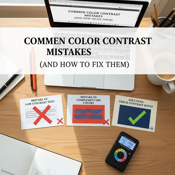
2. Ensure High Contrast Ratios (WCAG 2.1 AA)
High contrast is essential for both color-blind users and those with low vision. The Web Content Accessibility Guidelines (WCAG) 2.1 sets clear minimum contrast ratios at Level AA:
Tip: A great way to check if your design has enough luminance contrast (brightness and tone) is to view it in grayscale (monochrome). If you can still distinguish between elements, your contrast is likely strong.
3. Choose a Color-Blind-Friendly Palette
While avoiding color is impossible, you can choose a palette that naturally provides more contrast for the most common forms of color blindness (red-green deficiency).
- Avoid Problematic Combinations: Be extremely cautious when placing these colors in close proximity, especially to convey meaning:
- Red and Green (The most common form of confusion)
- Blue and Purple
- Green and Brown
- Light Green and Yellow
- Opt for Safer Combinations: Colors that differ significantly in lightness and hue are typically safer.
- Blue and Orange
- Blue and Red
- Use highly distinguishable shades (e.g., a dark navy blue and a vibrant yellow) instead of colors with the same lightness.
4. Improve Data Visualizations (Charts & Graphs)
Charts and graphs that rely solely on color-coding are a major barrier. Incorporate non-color indicators to differentiate data sets:
- Use Patterns and Textures: Apply different patterns—like stripes, dots, or cross-hatching—to distinguish bar segments, line graphs, or pie slices.
- Direct Labels: Label data series directly on the chart instead of relying on a color-coded legend alone.
- Shapes and Symbols: Use different geometric shapes (circles, squares, triangles) for points on a scatter plot or line graph.
5. Enhance Interactive Elements
All interactive elements must be clearly perceivable, even without color.
- Links: Underline all links to give them a distinct, non-color-based visual cue. This is a best practice that helps all users, especially for accessibility.
- Focus Indicators: Ensure that when a user navigates via keyboard, the focused element (e.g., a button or link) has a clear, high-contrast outline or border that is not just a change in color.
- Buttons: Ensure buttons have a distinct shape and text label, not just a colored background, and that the button’s text meets the 4.5:1 contrast ratio.
6. Test Your Design
Using simulator tools is a quick and powerful way to test your designs against different types of CVD.
- Color Blindness Simulators: Use tools (often available as browser extensions or design tool plugins) to filter your interface and see how it appears to users with Protanopia, Deuteranopia, and Tritanopia.
- Grayscale Check: As a primary test, review your design entirely in black and white. If it’s still clear and functional, you’re on the right track for color accessibility.
- Real User Testing: Whenever possible, include users with color blindness in your usability testing to gather firsthand feedback.
Here is the free Accessible Color Contrast Checker try it now!


