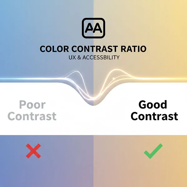
Color contrast is a fundamental element of accessible design that dramatically impacts the User Experience (UX) and web readability for everyone. It measures the difference in brightness and color between two elements, most commonly text and its background.
A high contrast ratio is essential because poor color choices can make digital content difficult, or even impossible, to read and interact with.
What is the Color Contrast Ratio?
The color contrast ratio is a numerical value that quantifies the difference in relative luminance (light intensity) between the foreground color and the background color.
- The ratio is expressed from 1:1 (no contrast, e.g., white text on a white background) to 21:1 (maximum contrast, e.g., black text on a white background).
- Higher values indicate greater contrast and, therefore, better legibility.
Poor Contrast Hurts Readability and Usability
When the contrast is too low, it creates significant friction for users.
The WCAG Standard for Accessible Design
To ensure digital experiences are inclusive and legally compliant, designers follow the Web Content Accessibility Guidelines (WCAG), the international standard for accessible design.
WCAG defines minimum contrast ratios, with Level AA being the commonly accepted industry standard:
Note: Text that is purely decorative or part of a logo/brand name (logotype) is exempt from these contrast requirements.
Benefits of High Contrast for UX
Designing with sufficient color contrast is not just an accessibility requirement; it is a best practice that enhances the user experience for all users:
- Improved Legibility: Content becomes easier and faster to read, reducing cognitive load and visual stress.
- Enhanced Usability: Critical interactive elements, like buttons and links, are clearly distinguishable, leading to more intuitive and error-free interaction.
- Stronger Visual Hierarchy: High contrast guides the user’s eye to the most important content, improving the structure and scannability of the design.
- Inclusivity: By accommodating users with visual impairments and age-related vision changes, you broaden your audience and create a truly inclusive product.
- Compliance: Adhering to WCAG standards ensures you meet ethical responsibilities and avoid potential legal liabilities.
Check Your Design: Use a Free Color Contrast Checker
The only reliable way to ensure your color combinations are accessible is to measure them using a dedicated contrast tool.
To improve your design’s UX and accessibility, use a free color contrast checker tool to input your foreground and background colors (usually by their Hex codes) and instantly calculate their ratio against the WCAG standards. This simple step is vital for creating a web experience that is functional, readable, and welcoming to everyone.


