Table of Contents
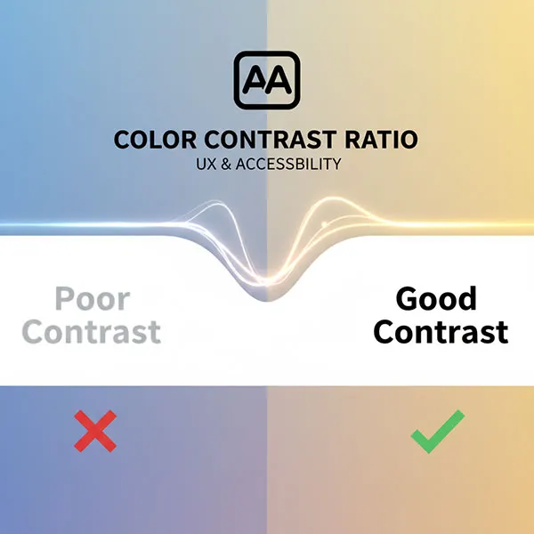
In today’s digital world, an accessible website isn’t just a nicety; it’s a necessity. Ensuring everyone, regardless of ability, can interact with your content is paramount. A critical component of web accessibility is color contrast – making sure your text and visual elements are clear and readable against their backgrounds. Poor contrast can make your site unusable for individuals with low vision, color blindness, or even those just viewing your site in bright sunlight.
Why Color Contrast is a Cornerstone of Web Accessibility
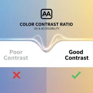
Imagine trying to read light grey text on a white background, or a subtle green button on a slightly different shade of green. Frustrating, right? For millions, this isn’t just an inconvenience; it’s a barrier.
WCAG standards, particularly 2.x, set specific contrast ratio requirements to ensure readability. For example, WCAG 2.1 Level AA requires a contrast ratio of at least 4.5:1 for regular text and 3:1 for large text. Meeting these standards significantly improves readability for:
- Users with low vision: Making text easier to discern.
- Users with color blindness: Preventing confusion between colors that appear similar.
- Elderly users: Who may experience reduced visual acuity.
- Users in challenging environments: Such as bright sunlight or on older screens.
Manually checking every color combination is impractical, which is why the best software for contrast and accessibility testing is indispensable.
Top Tools for Color Contrast Checking
While many comprehensive accessibility tools include contrast checking, some dedicated tools excel specifically in this area.
1. This is where contrast and accessibility testing software comes into play.
These tools help you identify and fix issues, ensuring your website complies with Web Content Accessibility Guidelines (WCAG) and provides an optimal experience for all users. At ToolsInFree.com, we believe in providing resources for a more inclusive web, starting with our own Accessible Color Contrast Checker.
1. Colour Contrast Analyser (CCA) by TPGi
- What it is: A free desktop application (Windows/macOS) considered the gold standard by many accessibility professionals.
- Why we recommend it: It allows you to use an eyedropper tool to select any foreground and background color directly from your screen – even from images or non-browser applications – and instantly see if it meets WCAG standards (AA, AAA). It’s invaluable for checking existing designs and screenshots.
- External Link: Download CCA from TPGi
2. WebAIM Contrast Checker
- What it is: A user-friendly, web-based tool from the highly respected WebAIM organization.
- Why we recommend it: Simply input HEX or RGB color values, and it calculates the contrast ratio, showing immediate pass/fail results for both normal and large text. It’s quick, reliable, and excellent for designers choosing color palettes.
- External Link: Use WebAIM Contrast Checker
3. Stark (Design Plugin & Web Tool)
- What it is: A suite of accessibility tools, primarily known for its plugins for popular design software like Figma, Sketch, and Adobe XD.
- Why we recommend it: It integrates contrast checking directly into your design workflow, allowing designers to catch issues before they even reach development. Stark also includes a Colorblind Simulator, which is incredibly useful for understanding how your designs appear to users with different forms of color vision deficiency.
- External Link: Explore Stark
Comprehensive Accessibility Testing Tools (with Contrast Built-In)
For a broader audit that covers more than just color contrast, these tools offer robust features for overall WCAG compliance.
1. WAVE (Web Accessibility Evaluation Tool) by WebAIM
- What it is: A free browser extension and web service that provides visual feedback about the accessibility of your web content.
- Why we recommend it: WAVE injects icons and indicators directly into your webpage, highlighting WCAG errors, alerts, features, and structural elements. It includes a dedicated contrast checker that shows where color contrast issues exist on your live page. It’s an excellent starting point for any accessibility audit.
- External Link: Install WAVE Browser Extension
2. axe DevTools (by Deque)
- What it is: A powerful and widely respected browser extension and open-source library.
- Why we recommend it: Built on the axe-core engine, it’s known for its accuracy and for reporting zero false positives, meaning every issue it flags is a genuine accessibility problem. It helps developers find and fix over 50% of WCAG issues automatically, including contrast, right within their browser’s developer tools.
- External Link: Get axe DevTools
3. Google Lighthouse (Built-in Chrome DevTools)
- What it is: An open-source, automated tool integrated directly into Chrome’s Developer Tools.
- Why we recommend it: Lighthouse performs comprehensive audits for performance, SEO, best practices, and crucially, accessibility. Its accessibility report includes checks for color contrast and provides actionable recommendations to improve your site’s compliance. It’s a fantastic first-pass audit tool for any web developer.
- How to use: Open Chrome DevTools (F12 or right-click > Inspect), go to the “Lighthouse” tab, and generate a report.
Enhance Your Website’s Accessibility Today
Implementing accessibility features isn’t just about avoiding legal issues; it’s about building a more inclusive internet for everyone. By utilizing the best software for contrast and accessibility testing, you can ensure your website is not only beautiful but also truly usable by all.
Ready to check your site’s color contrast instantly?
Try our free online today and take the first step towards a more accessible website!
For more free tools and guides on enhancing your website’s usability, explore our Accessible Color Contrast Checker Free Tools category.

