Table of Contents
Accessibility is not optional anymore. If your website fails basic color contrast rules, you are excluding users, hurting SEO, and exposing yourself to legal risk.
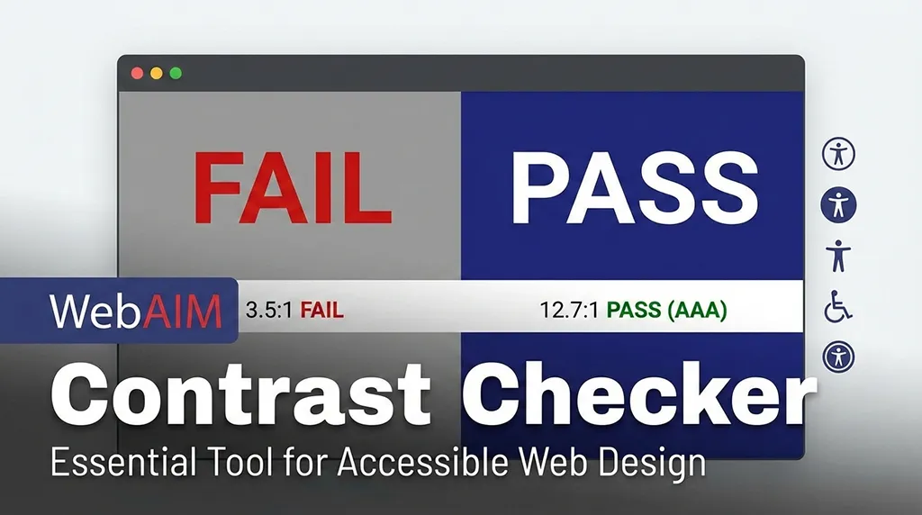
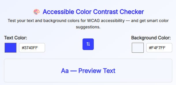
The WebAIM Contrast Checker is one of the most trusted tools to test whether your text and background colors meet WCAG accessibility standards.
In this guide, you’ll learn what the WebAIM Contrast Checker is, how it works, why it matters for SEO and usability, and how to properly test color contrast for real-world websites.
This article is written for developers, designers, SEO professionals, and site owners who want practical clarity — not theory.
What Is the WebAIM Contrast Checker?
The WebAIM Contrast Checker is a free accessibility tool created by WebAIM (Web Accessibility In Mind). It evaluates the contrast ratio between foreground text color and background color to ensure readability for users with visual impairments.
It checks compliance with:
WCAG 2.0
WCAG 2.1
WCAG 2.2
Level AA and AAA standards
If your text fails contrast requirements, many users simply cannot read it, especially users with low vision or color blindness.
Why Color Contrast Matters for Accessibility
Low contrast is one of the most common accessibility failures on the web.
Poor contrast affects:
Users with low vision
Color-blind users
Elderly users
Mobile users in sunlight
Users on low-quality screens
Accessibility isn’t about edge cases. It’s about millions of users.
How the WebAIM Contrast Checker Works
The tool calculates a contrast ratio using luminance values of the colors you enter.
Contrast Ratio Scale:
1:1 – No contrast
21:1 – Maximum contrast (black on white)
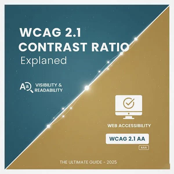
WCAG Requirements:
| Text Type | Level AA | Level AAA |
|---|---|---|
| Normal text | 4.5:1 | 7:1 |
| Large text (18px+ or 14px bold) | 3:1 | 4.5:1 |
| UI components & icons | 3:1 | — |
If your colors don’t meet these ratios, your content fails accessibility compliance.
WebAIM Contrast Checker vs Other Tools
Here’s the honest comparison:
WebAIM Contrast Checker vs Other Tools
✔ Trusted authority
✔ WCAG accurate
✔ Simple and fast
✖ Manual testing only
Best practice:
Use WebAIM for precision, scanners for coverage.
Browser DevTools
✔ Built-in
✔ Context aware
✖ Easy to miss edge cases
Automated Accessibility Scanners
✔ Scan entire pages
✖ Often inaccurate for contrast
✖ False positives
Common Contrast Mistakes Designers Make
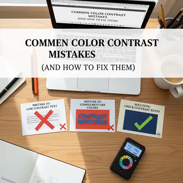
Let’s be blunt — these mistakes kill accessibility:
Light gray text on white background
Placeholder text with low opacity
Text over images without overlays
Brand colors prioritized over readability
“Looks fine to me” testing
Accessibility is not subjective. Contrast is math.
Does Color Contrast Affect SEO?
Directly? No.
Indirectly? Absolutely yes.
Accessibility improvements often improve SEO performance without touching keywords.
Google cares about:
User experience
Readability
Engagement
Accessibility signals
Poor contrast leads to
Higher bounce rate
Lower time on page
Bad Core Web Vitals perception
Who Should Use a WebAIM Contrast Checker?
If you fall into any of these categories, you need it:
Frontend developers
UI/UX designers
SEO professionals
Website owners
Government or education sites
SaaS and startup teams
Bloggers and content creators
Accessibility isn’t just for big companies anymore.
WebAIM Contrast Checker Limitations (Truth Matters)
Let’s be honest about what it doesn’t do:
Doesn’t scan full pages
Doesn’t detect text over images automatically
Doesn’t understand dynamic states (hover, focus)
Doesn’t replace manual testing
It’s a precision tool, not a magic fix.

Best Practices for Accessible Color Contrast
Follow these rules and you’ll avoid 90% of issues:
Design with contrast first, branding second
Test all states (hover, focus, disabled)
Avoid pure gray text for body content
Use overlays for text on images
Never rely on color alone to convey meaning
Accessibility done early costs nothing. Fixing it later costs time and money.
Why ToolsInFree’s Contrast Tools Matter
At ToolsInFree, accessibility tools should be:
Free
Simple
Accurate
No sign-ups
No fluff
If you’re serious about building inclusive websites, contrast testing isn’t optional — it’s baseline hygiene.
Frequently Asked Questions (FAQ)
What is a good contrast ratio for text?
For normal text, 4.5:1 is the minimum (WCAG AA). For large text, 3:1 is acceptable.
Is WebAIM Contrast Checker accurate?
Yes. It’s one of the most trusted tools in the accessibility community and widely referenced by professionals.
Does contrast affect mobile usability?
Absolutely. Poor contrast is worse on mobile, especially outdoors or on low-brightness screens.
Can brand colors fail accessibility?
Yes. Many popular brand palettes fail WCAG. Accessibility should override branding when necessary.
Is WCAG compliance legally required?
Depends on region, but many countries enforce accessibility laws for public-facing websites.
Can I automate contrast testing?
Partially. Automated tools help, but manual contrast checks are still required for accuracy.

