Table of Contents

What Is Color Contrast in Accessibility? A Beginner’s Guide (H1)
Color contrast isn’t just about aesthetics; it’s a critical component of building an accessible and user-friendly website. If you’ve ever squinted at light gray text on a white background, you’ve experienced poor contrast firsthand. For people with low vision, color blindness, or those simply viewing your site on a bright screen, this poor design choice can make your content completely unusable.
This guide will demystify what is color contrast in the context of web design, explain why it’s essential for all users, and show you the fastest way to check your site’s compliance.
Understanding the Basics: The Color Contrast Ratio (H2)
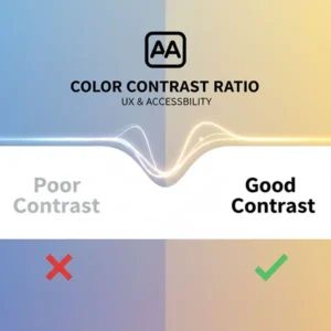
At its heart, color contrast is the difference in brightness between two colors. In web accessibility, we measure this using a numerical value called the color contrast ratio.
The contrast ratio ranges from 1:1 (e.g., white text on a white background—no contrast) to 21:1 (e.g., black text on a white background—maximum contrast). The higher the ratio, the easier the text is to read.
Why Color Contrast Accessibility is Non-Negotiable (H2)
Ignoring contrast issues is the biggest mistake in accessibility design.
- For Visually Impaired Users: Good contrast is essential for users with various visual impairments, including age-related vision loss, cataracts, and different forms of color blindness. Without it, your site is effectively blocking them from accessing your information.
- For Everyone Else: Strong contrast benefits users who are accessing your site in difficult lighting conditions (like outdoors in the sun) or using a low-quality monitor. Better contrast equals less eye strain for all visitors.
- Legal Compliance: In many jurisdictions, websites and digital tools are legally required to be accessible. Failing to meet contrast standards can expose your organization to unnecessary legal risk.
Meeting the Standard: WCAG Color Contrast Guidelines (H2)
The gold standard for web accessibility worldwide is the Web Content Accessibility Guidelines (WCAG). These guidelines provide clear, measurable standards for color contrast ratios.
The two main compliance levels you need to know are:
Important Note: Large text (18pt or 14pt bold) has a slightly lower requirement of 3:1 at the AA level, as it’s inherently easier to read.
Straightforward Conversion: Test Your Site in Seconds (H2)
Do you know if your website meets the WCAG 2.1 AA standard right now? Guessing is risky, but testing doesn’t have to be complicated.
The most straightforward way to ensure compliance and improve your design is to use a dedicated tool.
Check your colors instantly using our free online tool:
Simply input your foreground (text) and background color codes, and our tool will instantly tell you your ratio and whether you pass or fail the WCAG AA and AAA standards.
Conclusion
Achieving good color contrast accessibility is one of the quickest ways to dramatically improve the usability and reach of your website. It’s a foundational step in good accessibility design. By understanding the basic color contrast ratio requirements set out by WCAG color contrast standards, you can create a web experience that truly works for everyone.


